
7 Mistakes Making Personalized POD Products Hard to Convert (Even with Great Artwork)
Summary
- The Customization Experience is a crucial factor determining whether customers "Add to Cart" in personalized POD E-commerce.
- Too many options displayed at once or technical language can confuse customers, leading to "decision paralysis" and reduced conversions.
- Slow or mobile-unoptimized Live Previews, along with a lack of input validation, degrade the user experience.
- Technical errors related to Print-files can lead to significant profit losses.
- It's essential to add intuitive customization guides and measure lead source effectiveness to optimize marketing strategies.
- Check and fix technical and UX/UI bottlenecks before launching new products to ensure conversion rates.
Customization Experience: More Than Just Eye-Catching Artwork
In the Personalized Print-on-Demand (POD) E-commerce industry, eye-catching artwork only tells half the story. The other 50%, which determines whether customers click "Add to Cart," depends entirely on the Customization Experience on the Product Page. Customers need to understand what they can customize, see instant results, and trust that the product they receive will be exactly as they saw in the Live Preview.
If you're spending money on ads but your Conversion Rate (CR) is still low, immediately check these 7 technical and UX/UI "bottlenecks" to improve performance.
1. Too Many Options Displayed Upfront
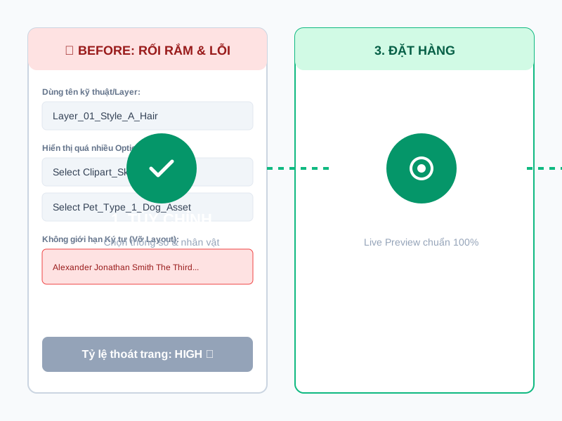
Every choice presented requires the customer's brain to make a decision. When opening a product page and immediately facing dozens of selection boxes, customers can easily fall into a state of "decision paralysis" and leave.
 Solution:
- Use Conditional Logic (show/hide conditions).
- Only retain core options initially (e.g., number of people/pets).
- When the customer selects "2 people," the system then expands options specifically for the first and second person.
2. Option Names Use Technical Seller Language
This is a very common mistake when setting up personalization apps. Many sellers keep the Photoshop layer names. Seeing phrases like Layer_Hair_01, Clipart_Man_Style_B, or Asset_Dog_V2 will confuse customers and make the experience feel unprofessional.
Solution:
- Change all field names to friendly and easy-to-understand "human language."
- Use relatable terms such as:
- Your Hair Style
- Skin Color
- Puppy's Name
- Message for Mom
3. Slow or Unclear Live Preview on Mobile
Over 80% of POD traffic comes from mobile devices. If a customer selects a shirt color or hairstyle and the Live Preview area takes 3-5 seconds to render, or the image is too small for them to clearly see the text they just entered, the bounce rate will skyrocket.
Solution:
- Optimize the file size of input clipart.
- Set up a Preview frame with flexible Zoom capabilities.
- Ensure the display resolution is sufficient (72 DPI) to maintain smooth page loading speed on Mobile.
4. No Constraints on Customer Input (Input Validation)
Customers might enter a lengthy paragraph into a name field, or use special characters, icons, or emojis that your font doesn't support. This immediately causes text to overlap, go out of bounds, and break the entire design Layout.
Solution:
- Set a maximum character length (Max Character Length) for each text field.
- Add pre-filled placeholder text (e.g., Enter up to 12 characters).
- Block unsupported special characters or emojis directly from the input field.
5. Web Preview is Correct, But Exported Print-File is Wrong
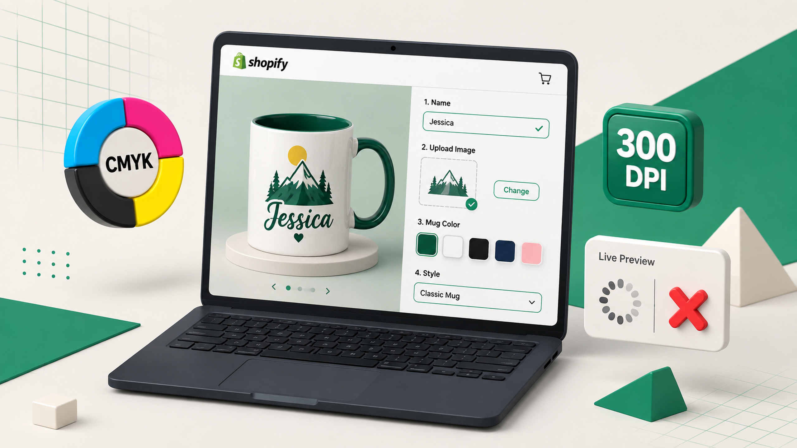
This is the most dangerous "trap," directly impacting profit margins. The display looks good, but when the system exports the Print-file to the Supplier, layers are missing, fonts are incorrect, the 300 DPI ratio is wrong, or CMYK color ranges are off.
Solution:
- Build a Dual-Canvas workflow.
- Always perform at least one actual Test Order from the product page to the print file download stage to compare each Layer, Bleed area, Font, and sharpness before scaling ads.
6. Lack of Images/Videos Guiding Customization
Not all customers are familiar with online customization. Without guidance, they might skip important steps or not know how to make the product more meaningful.
Solution:
- Immediately add an Infographic image or a short video (5-10 seconds) right below the first gallery image, explaining the simple 3-step process:
- Choose parameters & characters
- See a real-time preview (Live Preview)
- Click Order & Wait for your gift
7. Not Measuring Lead Sources and Actual Conversions
You cannot optimize what you do not measure. Many sellers run numerous channels (Blogs, Fanpages, Groups, Ads) but don't know exactly which traffic sources are bringing in quality Personalized orders and which are just generating "click fraud."
Solution:
- Implement detailed UTM codes for each navigation link.
- Closely track the lead lifecycle from content reception/access, becoming a Qualified Lead, to successful order conversion to accurately allocate marketing budget.
IMMEDIATE ACTION CHECKLIST
Here are steps you should take immediately to improve the customization experience in your store:
- Select the best-performing product page.
- Open your personal phone, access it, and manually customize it like a new customer.
- Proceed to place one Test Order and download the Print-file for inspection.
- Note down the single biggest Bottleneck that frustrates you.
- Fix that bottleneck completely before creating or adding any new Artwork designs!

Need to Standardize Your Personalized POD Workflow on Shopify?
Optimizing the UX/UI interface, Live Preview, and ensuring automatic 300 DPI print-file rendering requires deep technical understanding.
VertexTrue specializes in helping Shopify Sellers build and optimize professional Personalized POD systems with Teeinblue:
- Set up smooth Option & Conditional Logic structures.
- Control CMYK color ranges and 100% automatic print-file standardization.
- Optimize Live Preview speed on mobile interfaces.
👉 Learn about VertexTrue's Teeinblue standardization solution at: https://vertextrue.com/teeinblue